wooden tooth records
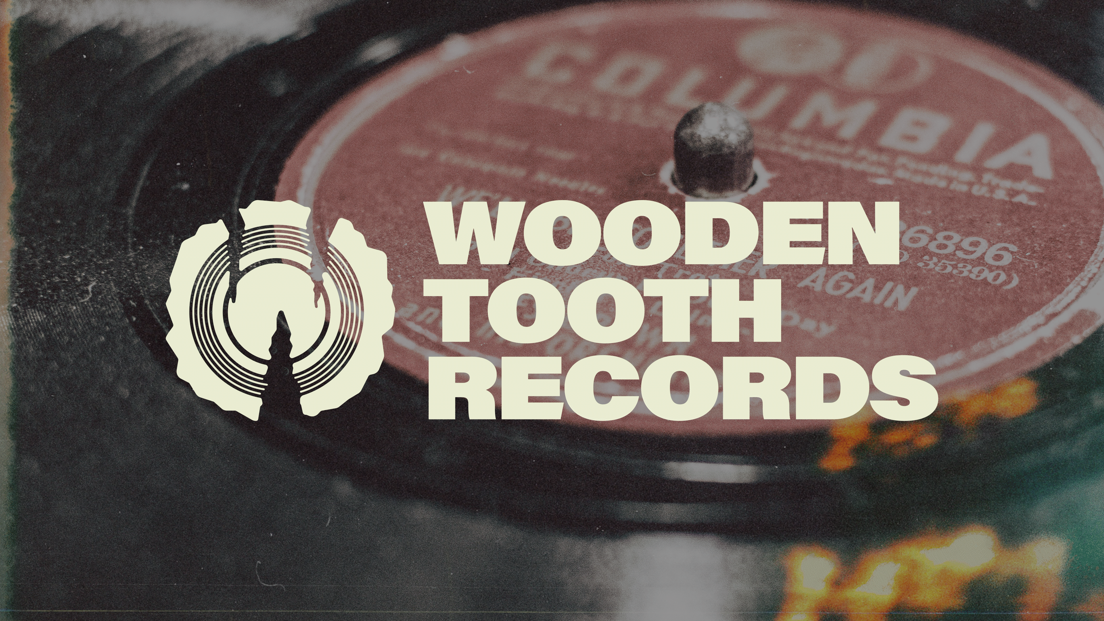
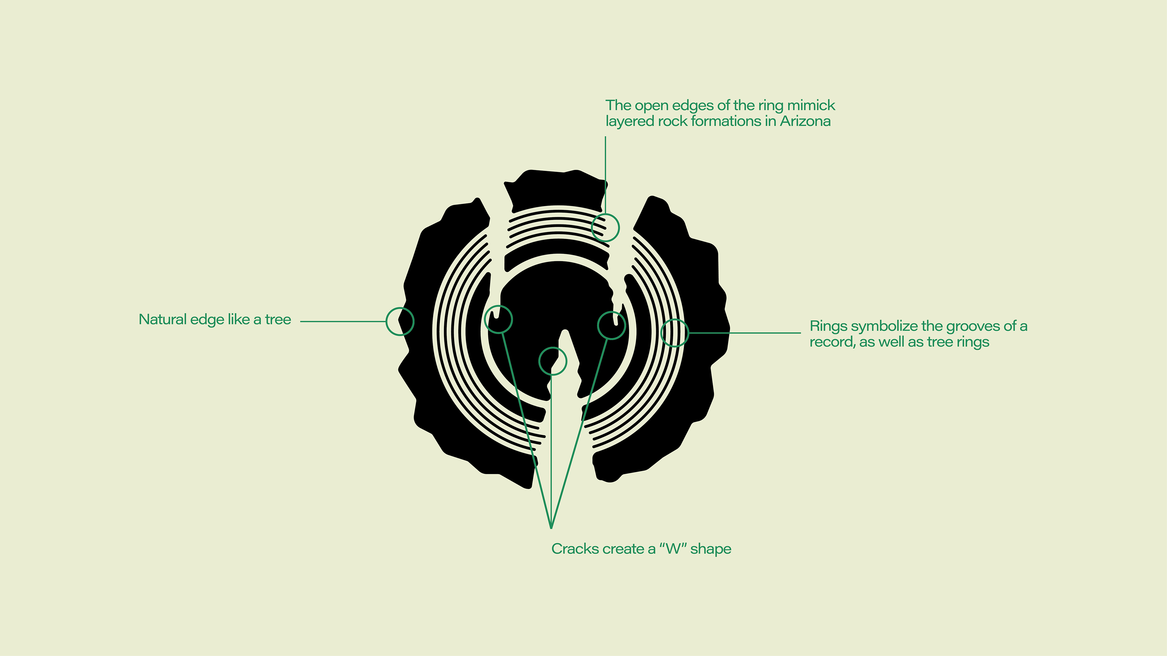
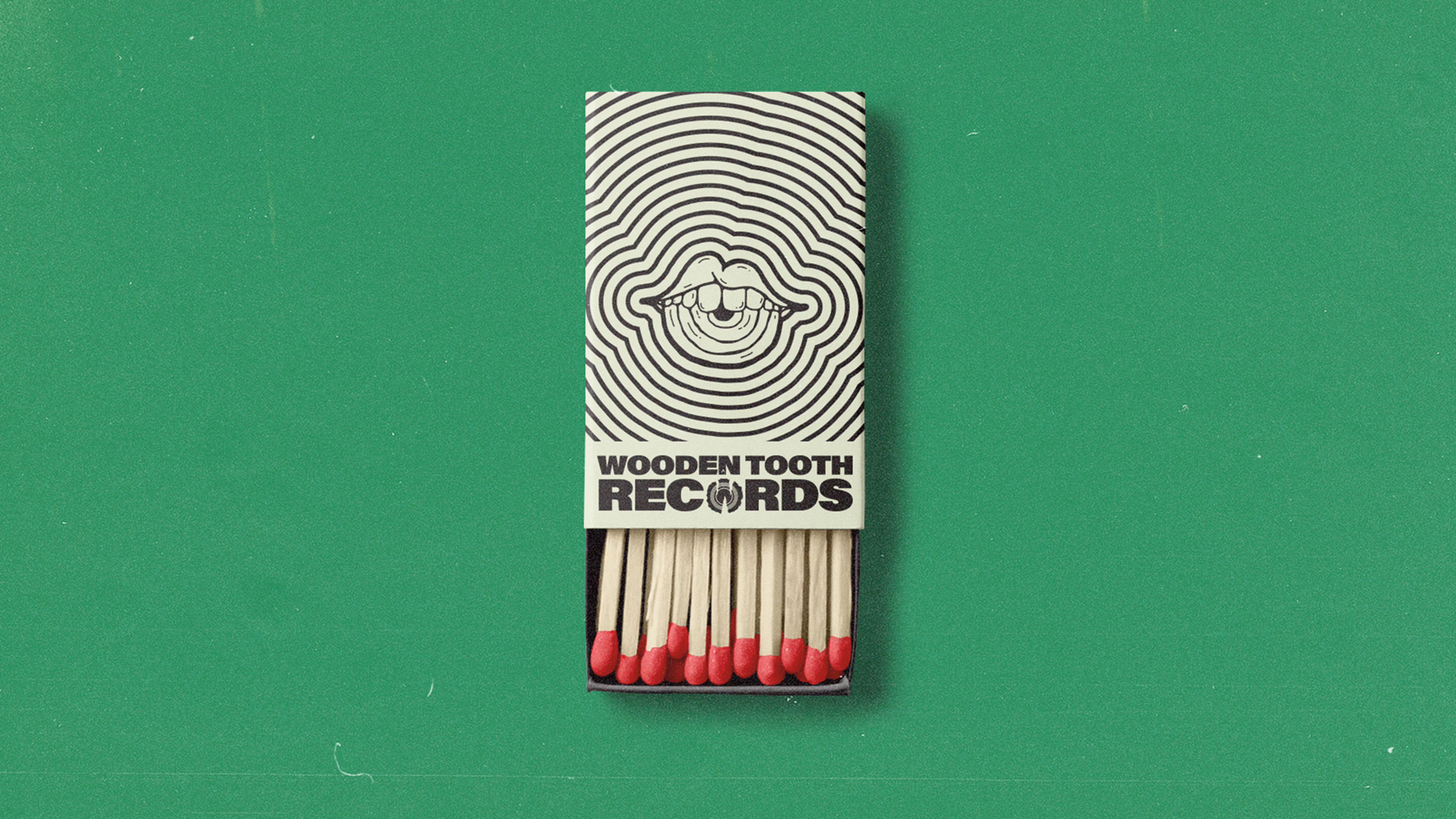
This was a concept re-design of Wooden Tooth Records brand. Wooden Tooth Records is a small, local record store in Tucson Arizona. While their original logo had a lot of energy, it struggled in making connections with the brand name and product. The goal of the new logo was to maintain the gritty, punk aesthetic, but also strengthen the synergy between the business name and the logo mark. The final deliverable was a tree slice, roughly formed in the shape of a “W”. Inside the tree slice were tree rings, formed by the record grooves.
Illustrator, Photoshop
1
The goal of the new logo was to maintain the gritty, punk aesthetic, but also strengthen the synergy between the business name and the logo mark
1
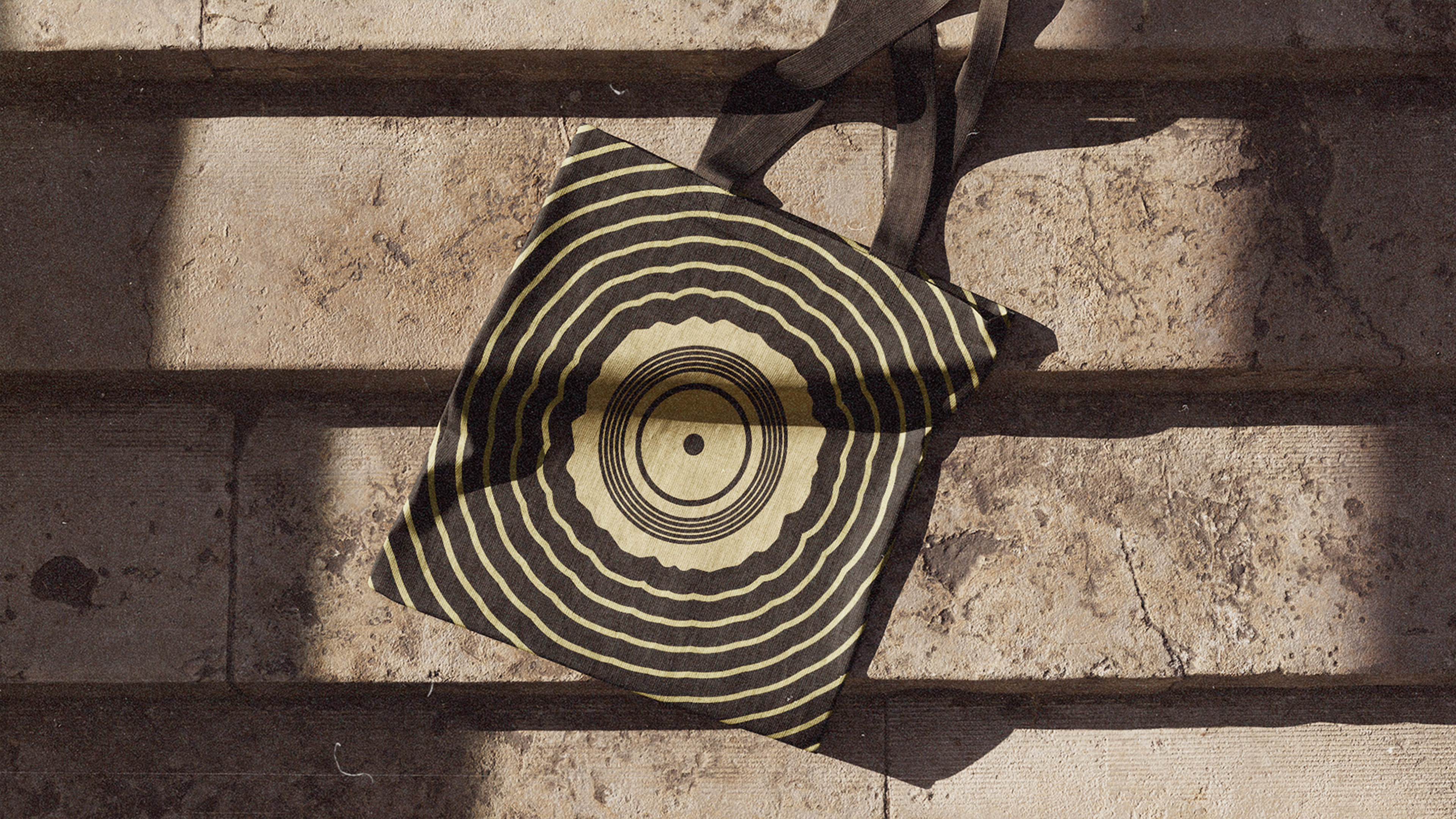
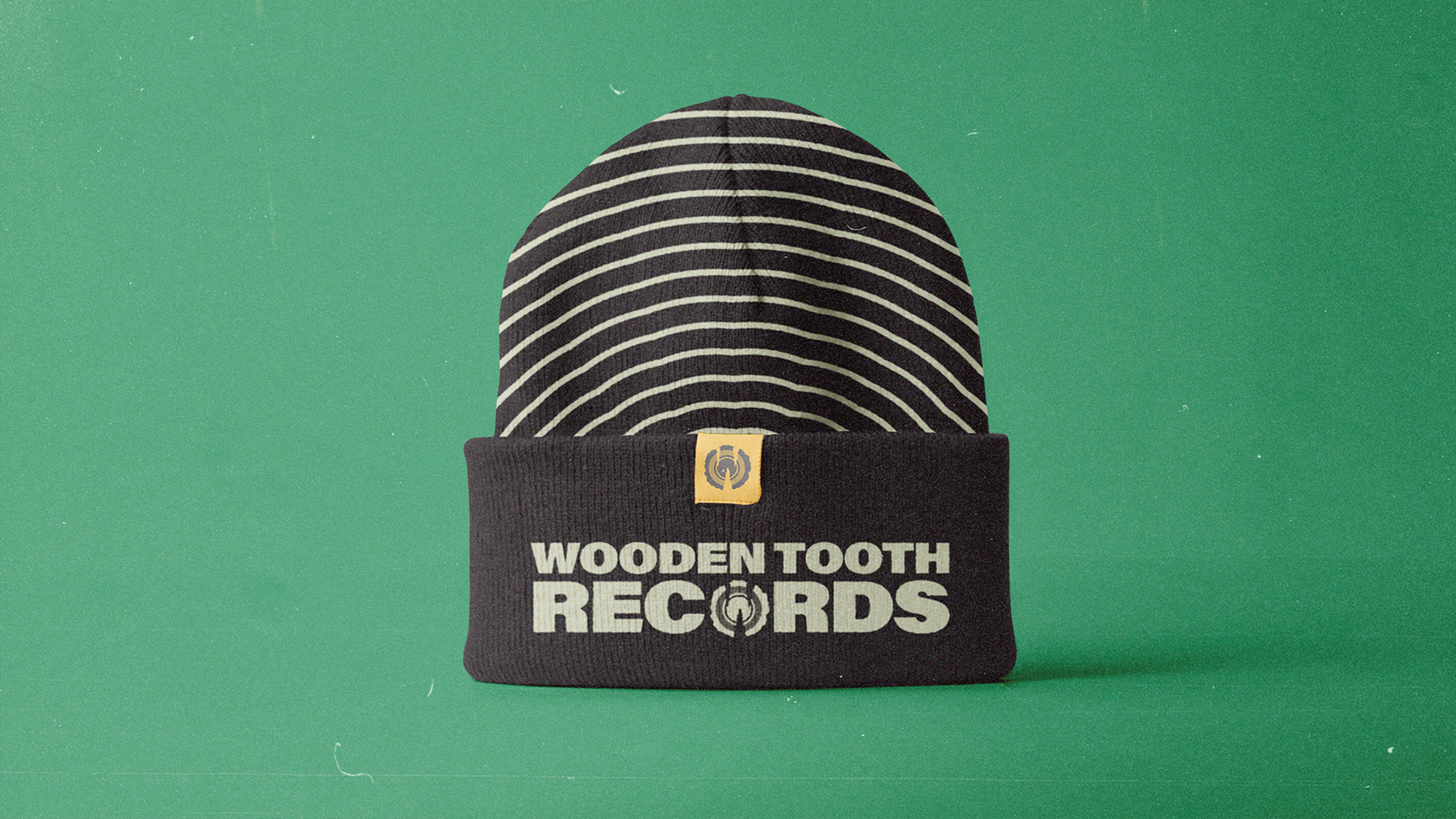
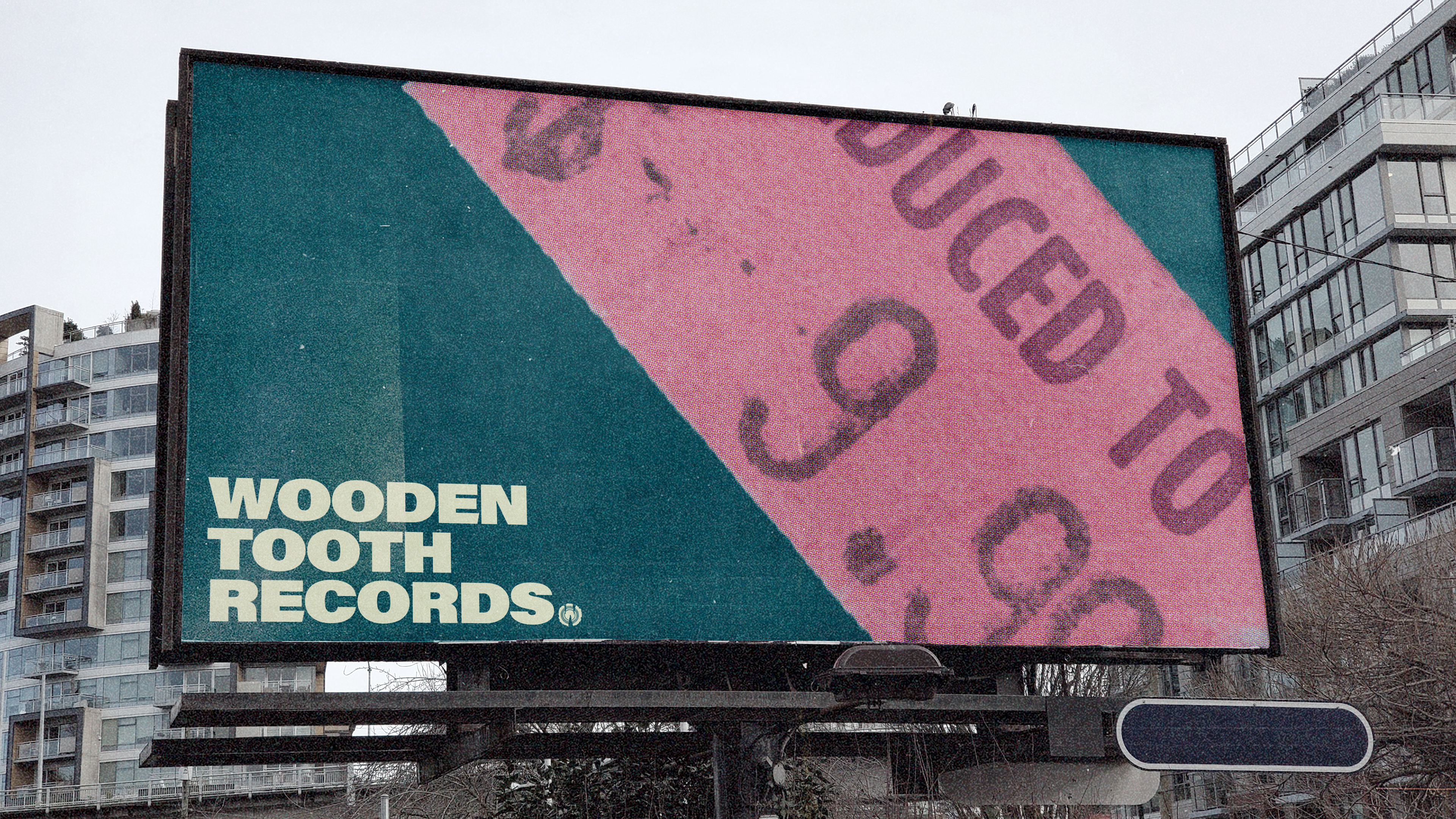
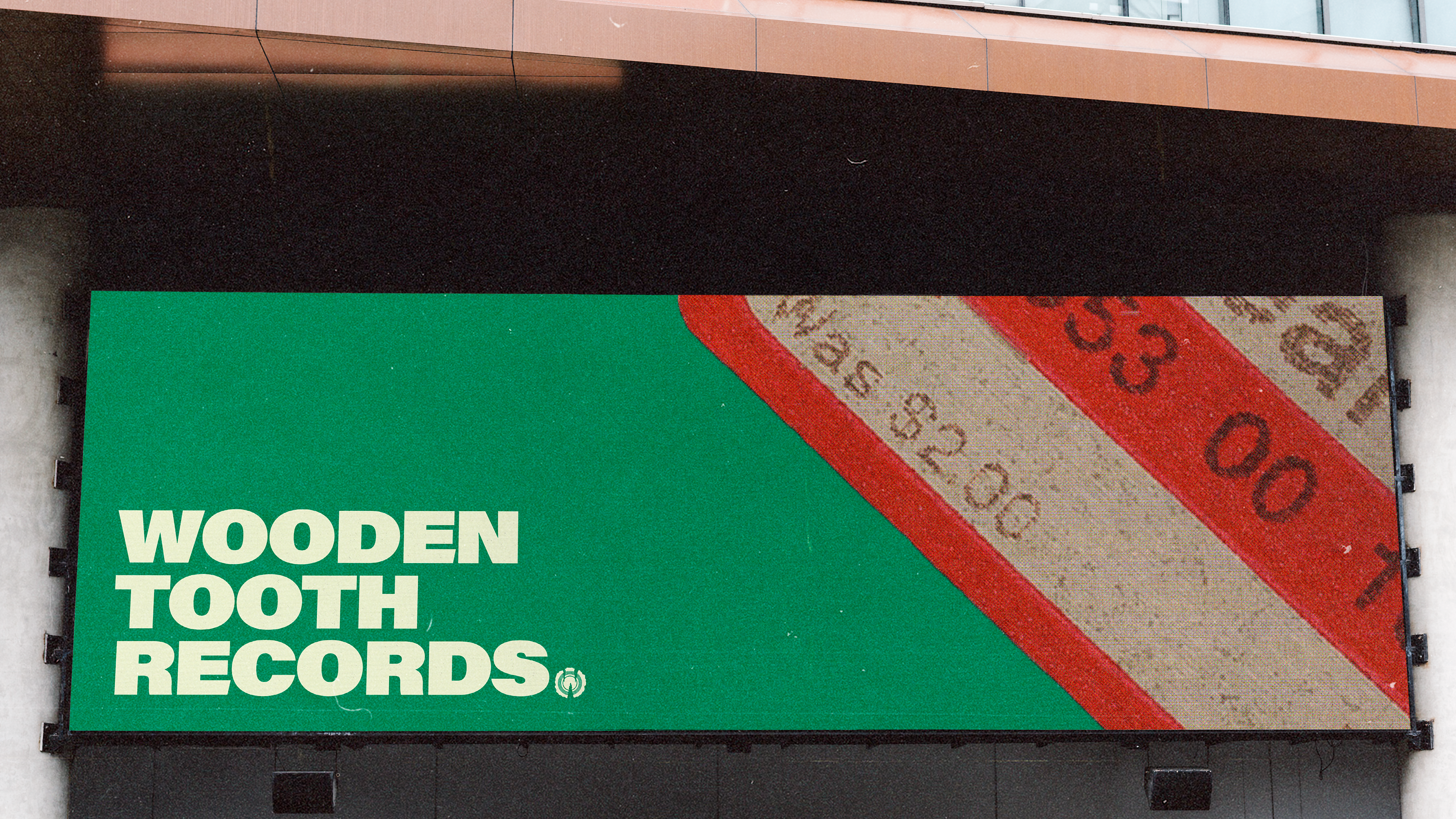
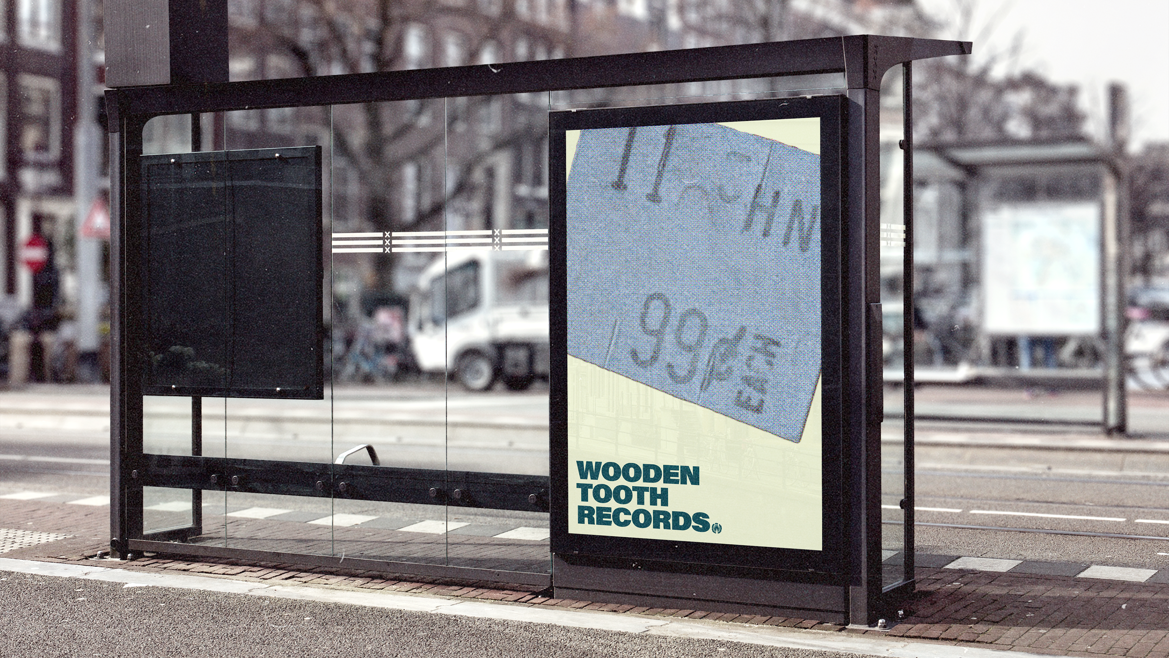
The goal of the OOH was to define the business as a boutique secondhand store and mimic the feeling of crate digging for records
1
It was important that the supporting illustrations live in the same visual universe as the logo and add to the brand energy


1
The repeated graphic lines not only symbolized tree rings and record grooves, but they added this sense of sound and vibration to the design