Seattle Sonics
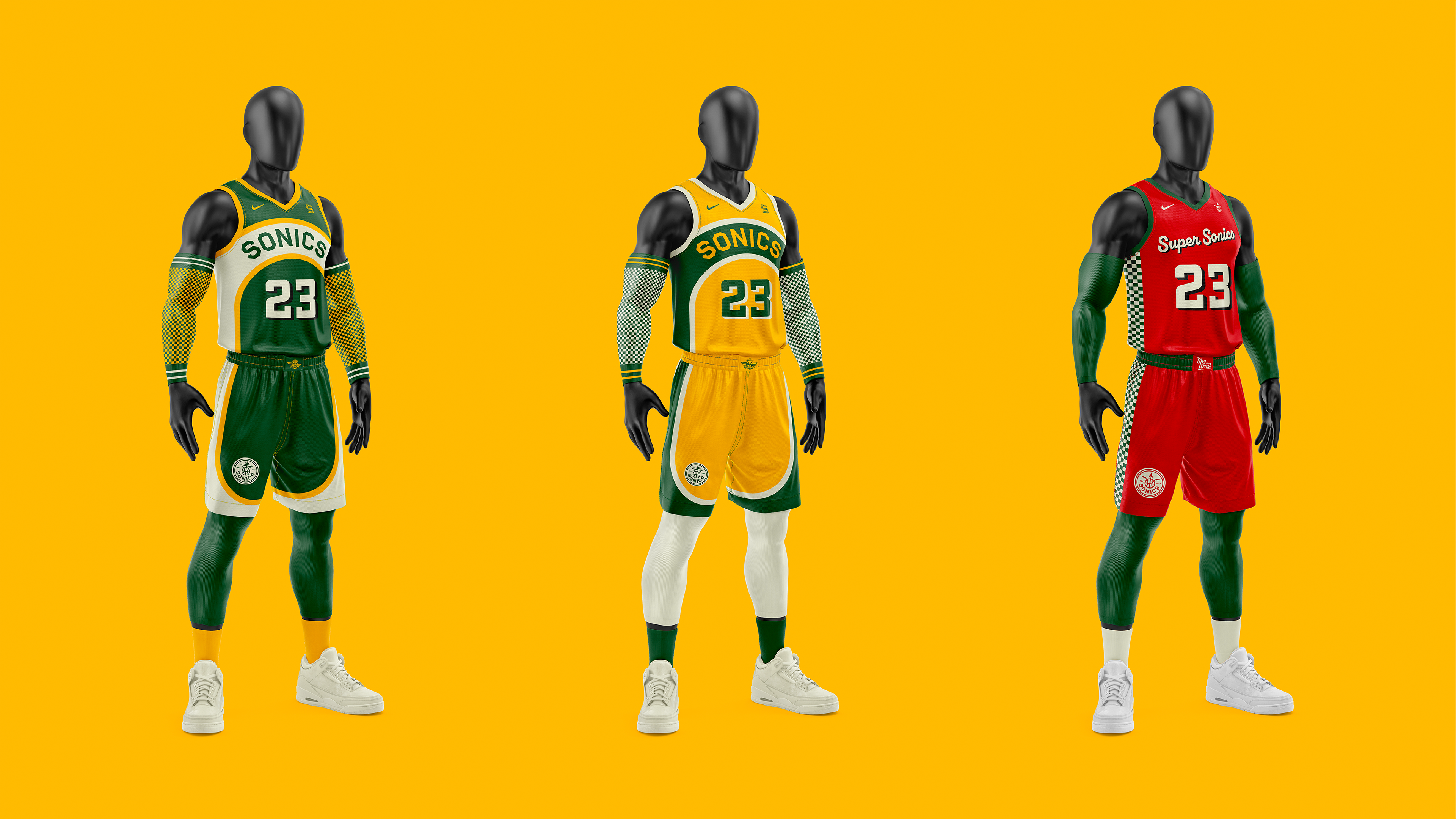
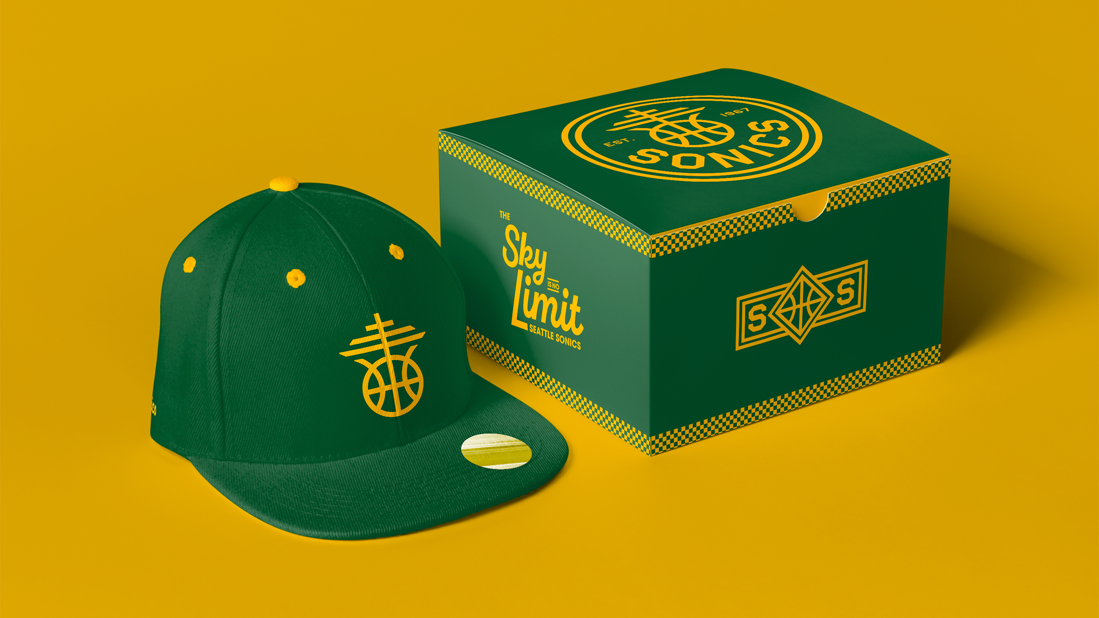
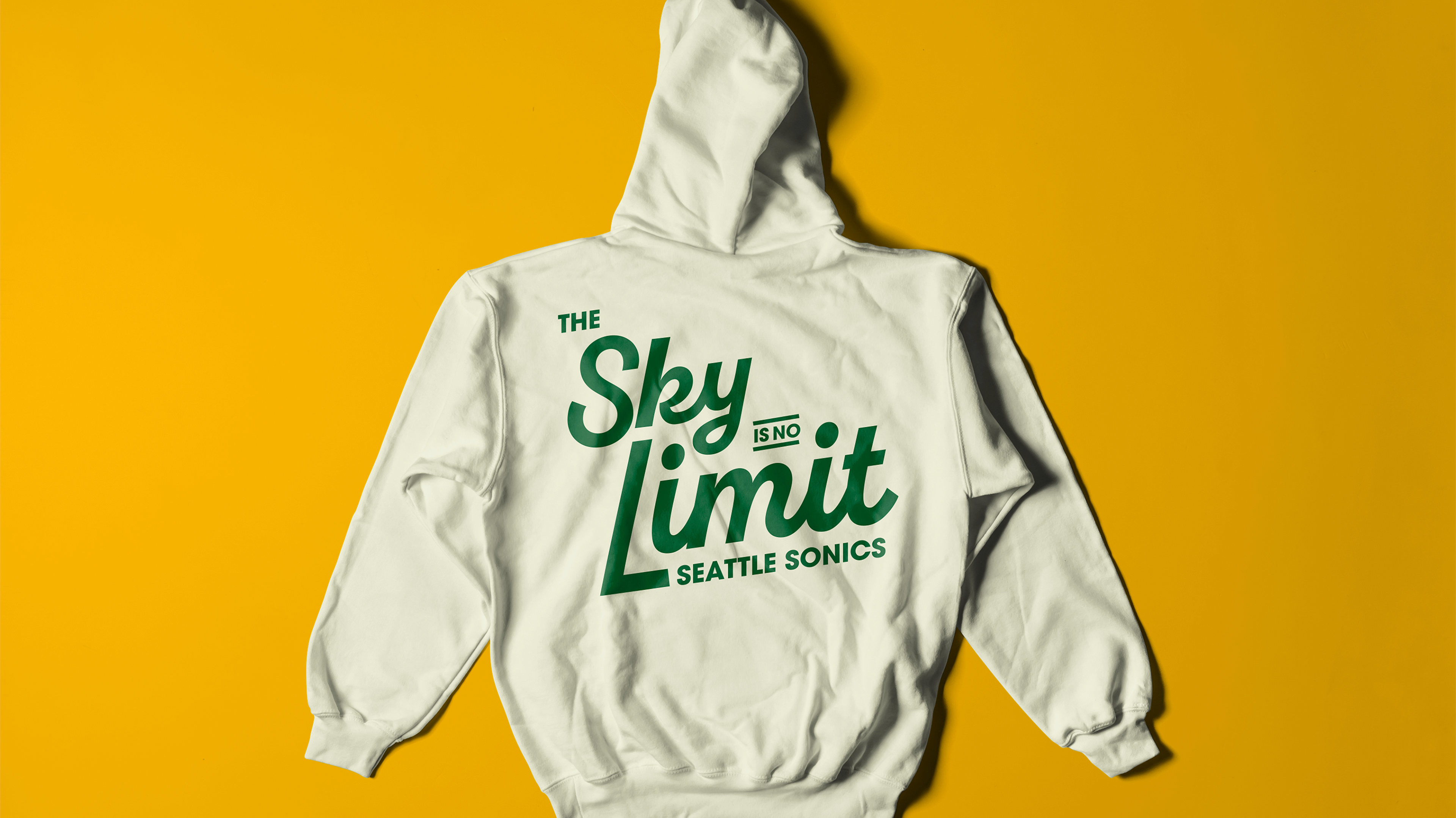
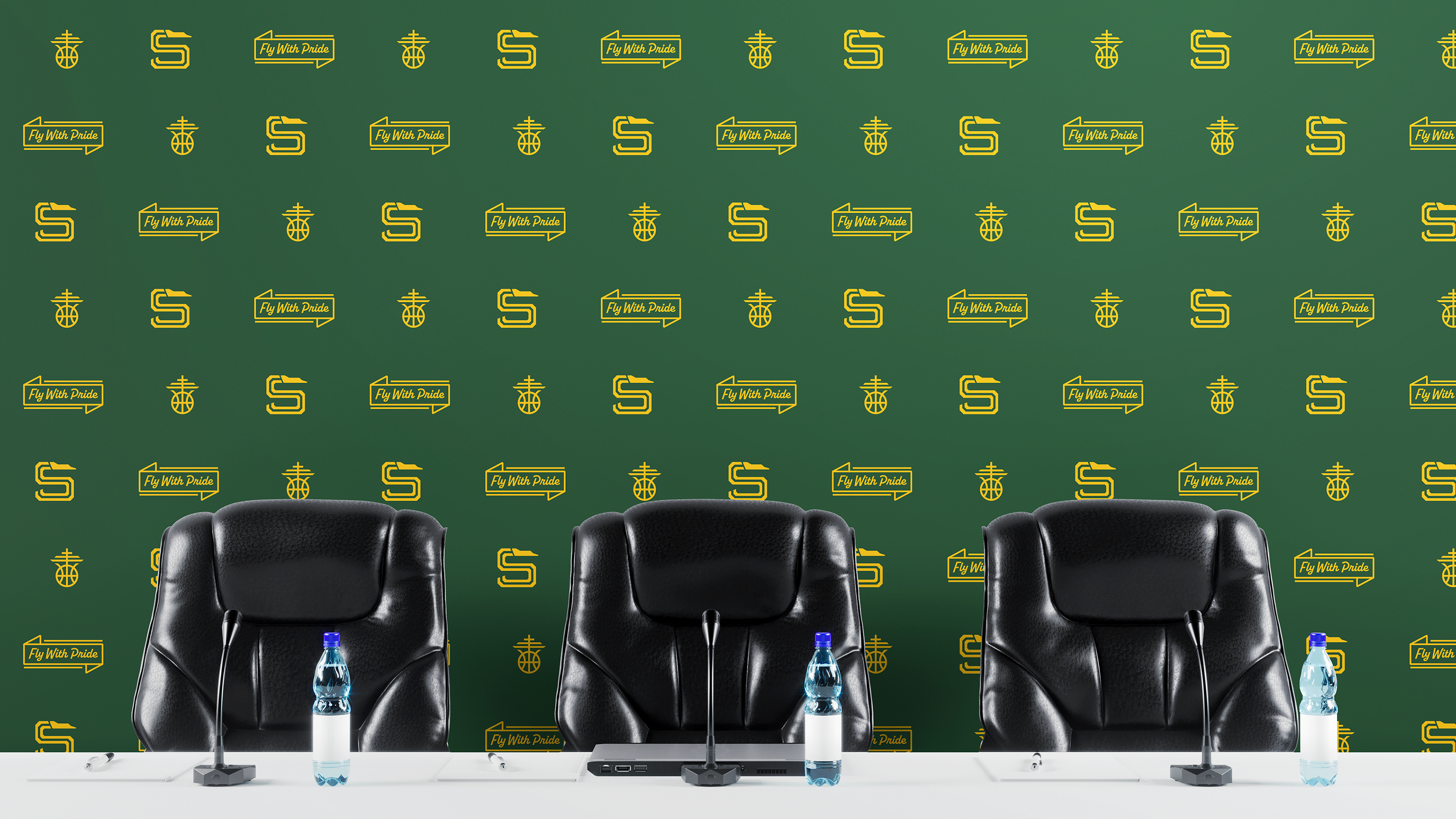
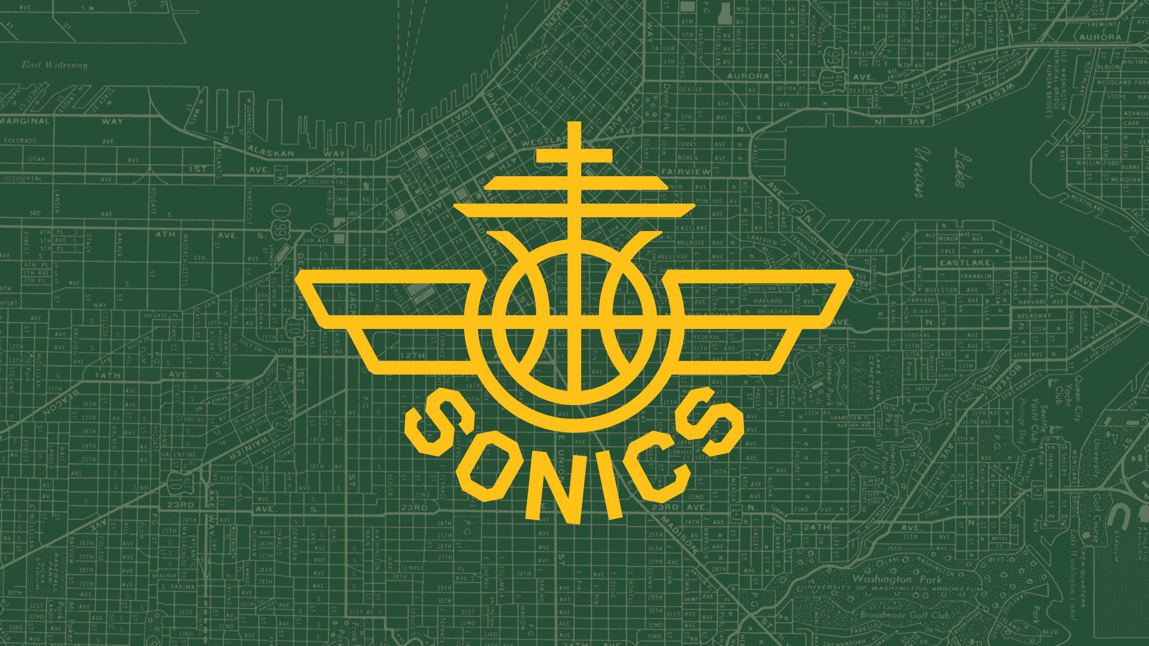
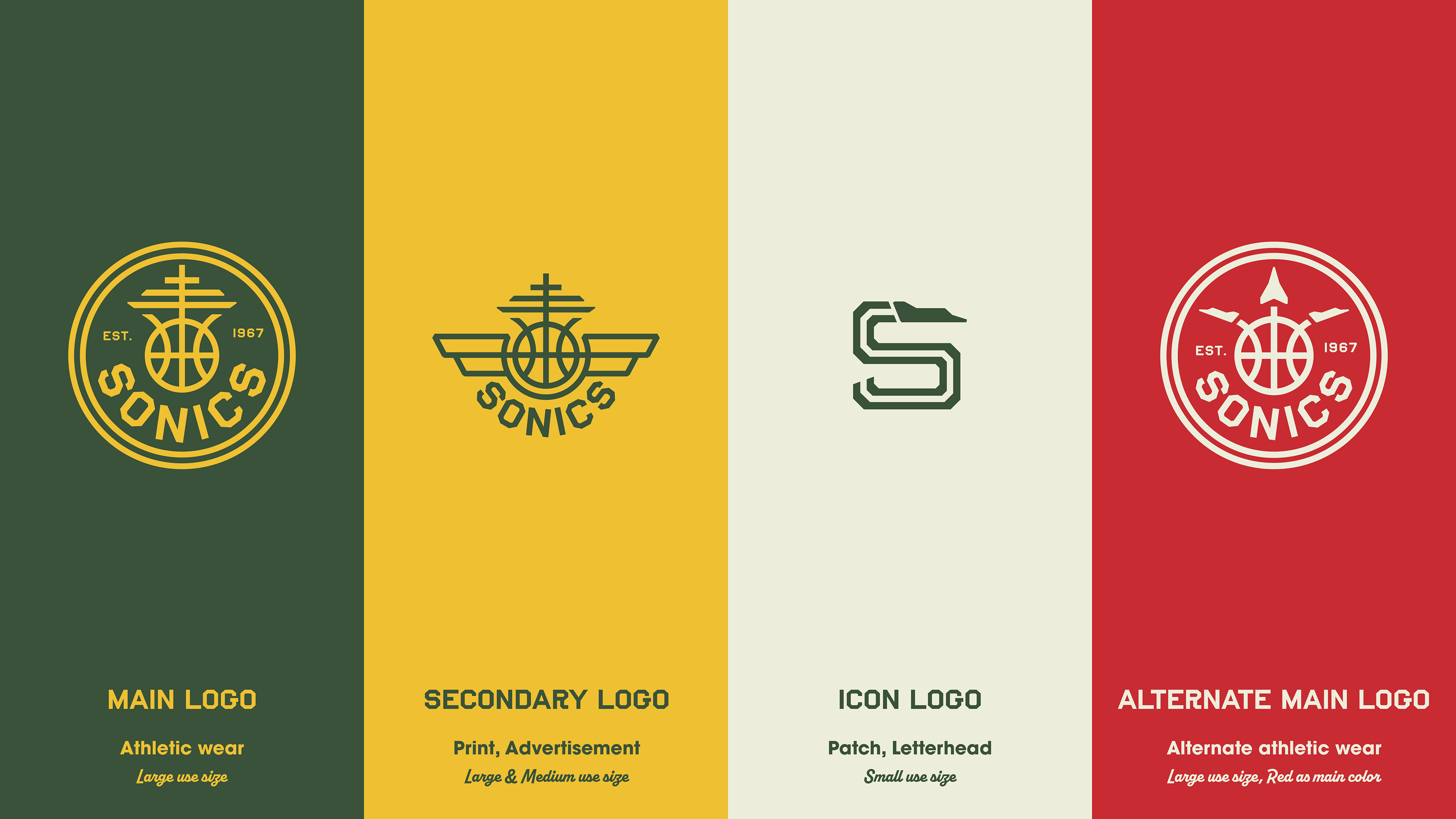
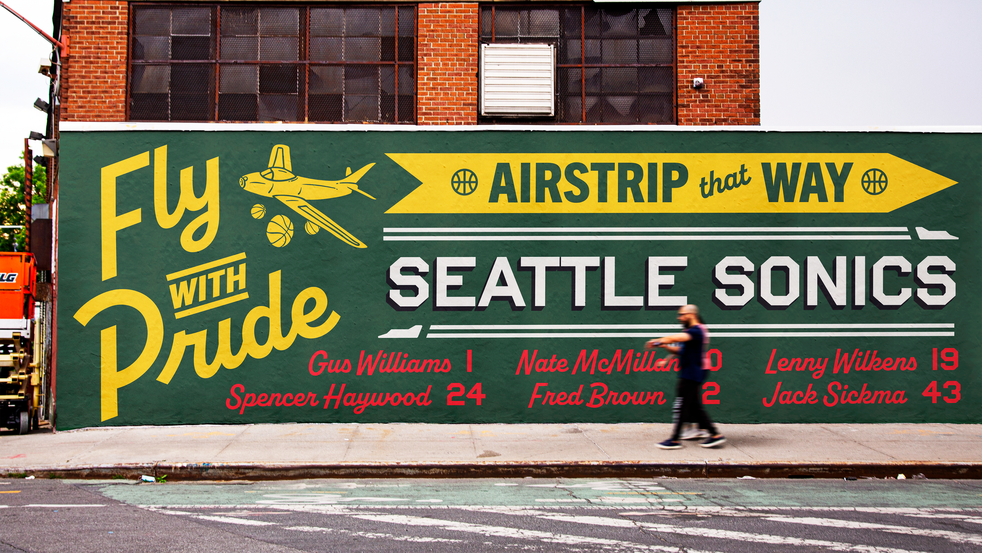
This was a concept re-design of the Seattle Sonics Branding. The previous design had a nostalgic quality but had dated itself over time. The goal was to create a timeless, regional branding system that could scale to the various needs of an NBA team. The Sonic name was based off a jet developed by Boeing, so the central theme of the re-design was pairing plane and Seattle iconography together. The type was inspired by the mechanical lettering that could be found in the Boeing factory or down by the Seattle Pier juxtaposed against some of the hand lettering type in Pike Place Market.
Illustrator, Photoshop, Fresco
1
The central theme of the re-design
was pairing plane and Seattle
iconography together
was pairing plane and Seattle
iconography together
1
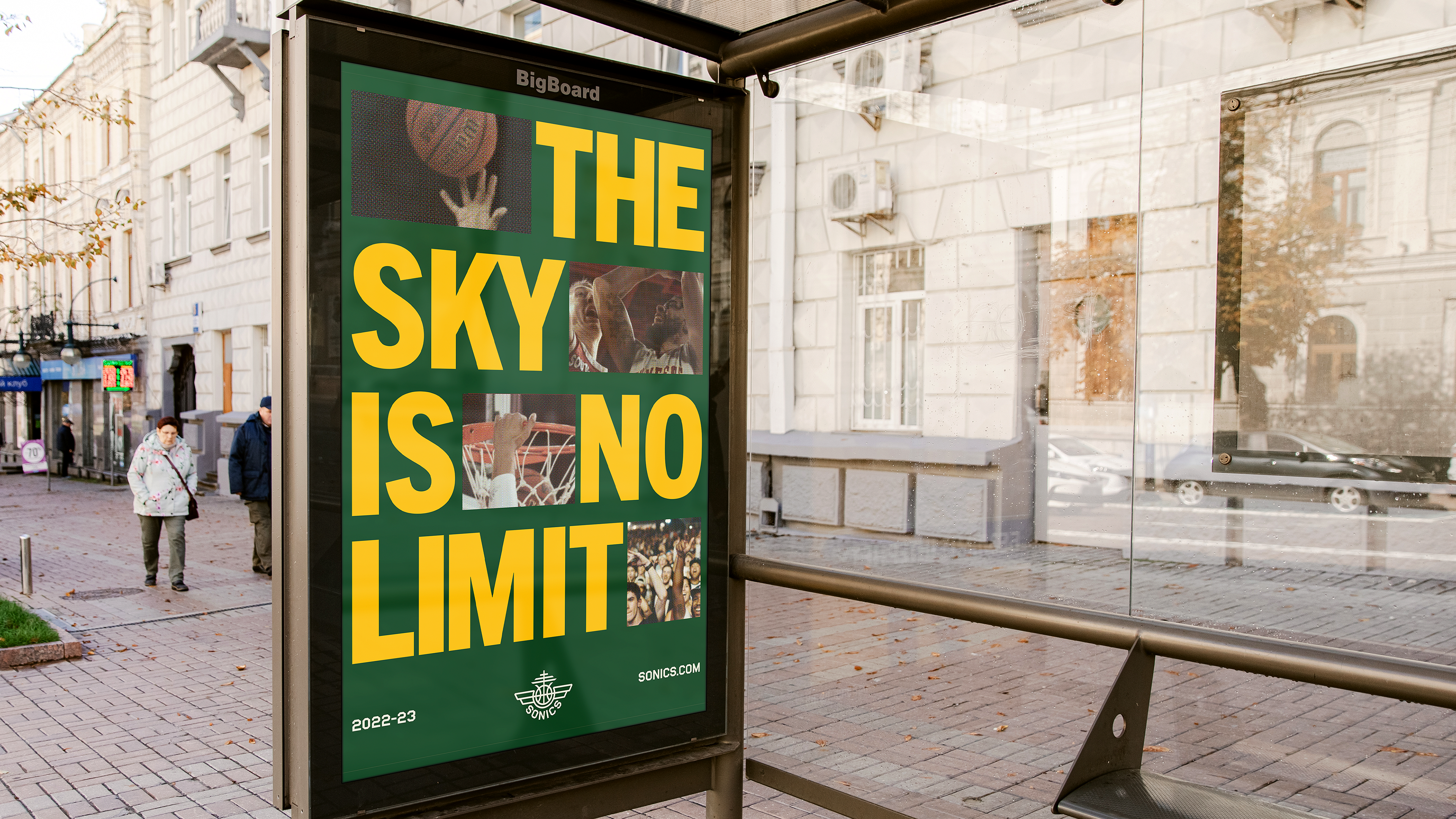
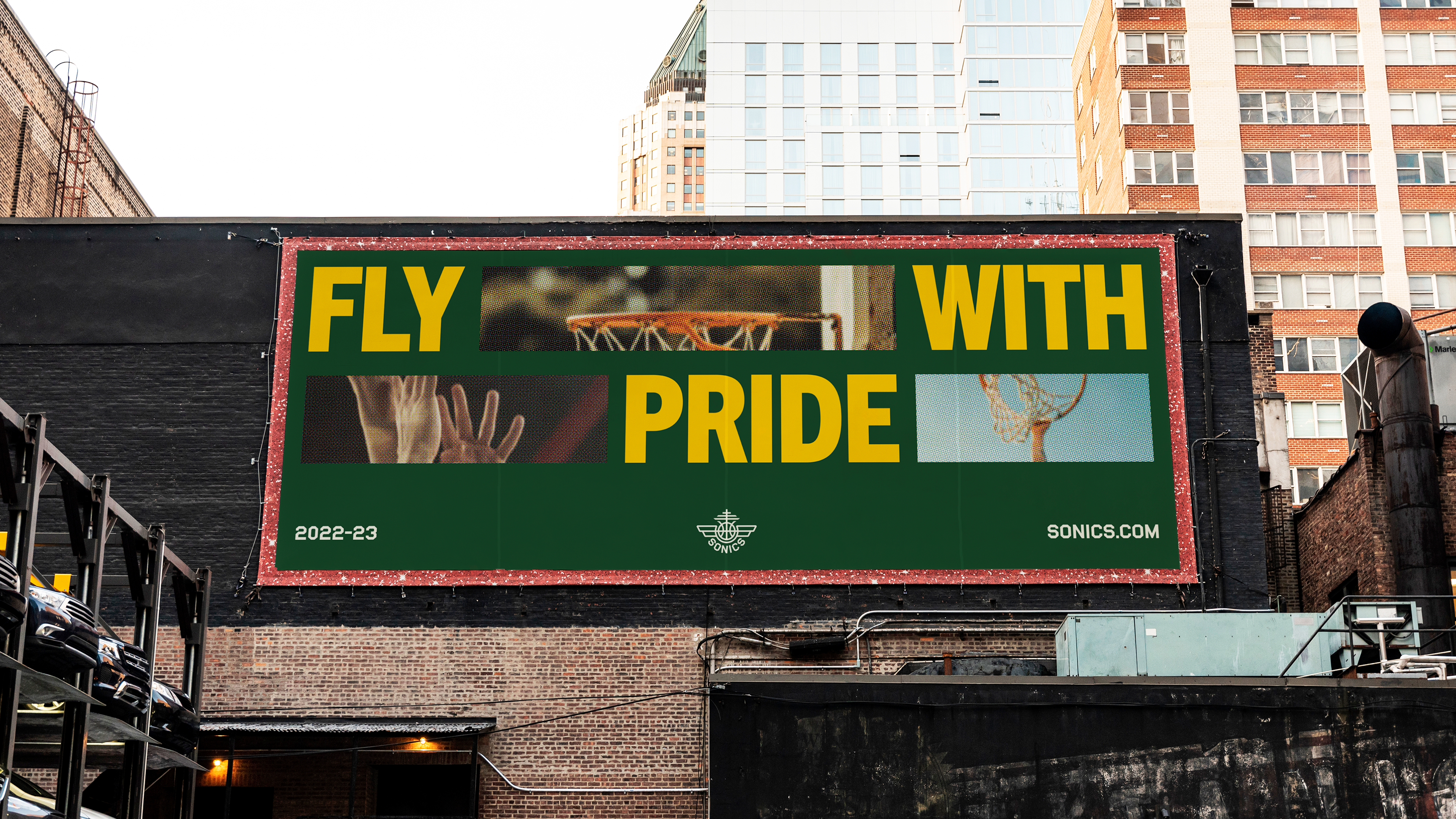
The goal of the imagery was to capture the feeling of supersonic speed by cropping in tight on sequential images of a basketball play
1
The type was inspired by the mechanical lettering that could be found in the Boeing factory
1
The goal was to create a timeless, regional branding system that could scale to the various needs of an NBA team